


Logo Redesign Mistakes and How to Avoid Them

The most damaging logo redesign mistakes are strategic, not artistic. You change the logo without a clear reason, throw away the parts customers recognise, skip research, ignore how the logo will be used at small sizes, or launch without a rollout plan. Each one is avoidable if you decide the purpose of the change first, keep what already works and test before you commit.
This guide walks through the mistakes we see most often, how to tell a refresh from a full redesign, a sensible process to follow, and how to make a logo scale from a social media icon to a shop sign.
TL;DR
- Start with a business reason (new name, new offer, new audience), not boredom or a passing trend.
- Keep the distinctive elements customers already recognise, such as colour, symbol or lettering, unless you have a strong reason to drop them.
- Research your audience and test options before finalising, then check trade mark conflicts before you print anything.
- Design for the smallest and largest uses first: fine detail, tiny text and straplines are what usually fail.
- Plan the rollout and the brand guidelines as part of the project, not as an afterthought.
Table of Contents
- Why logo redesigns go wrong
- The seven logo redesign mistakes to avoid
- Logo refresh or full redesign?
- A logo design process that avoids the mistakes
- Designing a logo that scales
- Write the rules down: brand guidelines
- Budget, scope and rollout
- Our perspective
- Work with one team on your redesign
- A pre-launch checklist
- FAQ
- Sources
Why logo redesigns go wrong
A logo is a shortcut to memory. Customers do not read it, they recognise it: the shape, the colour, the way the name sits. A redesign works by changing the right things while that recognition survives. It fails when the shortcut breaks.
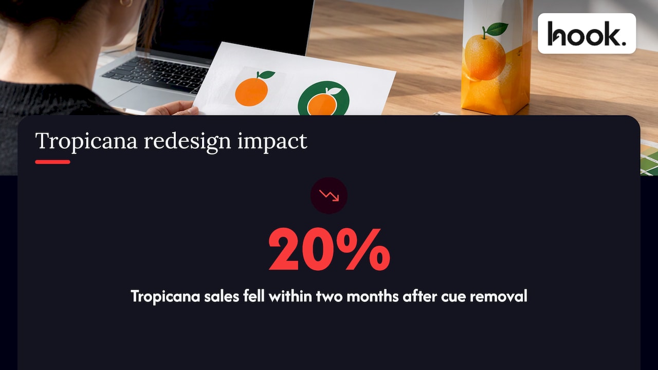
A well-known example is Tropicana’s 2009 carton redesign. Advertising Week reports that it removed a visual anchor shoppers relied on, coincided with a 20% sales drop in two months and was reversed. That was packaging rather than a logo, but the lesson carries over: people navigate by familiar cues, and removing them has a cost.
For a business owner or marketing manager in Oxfordshire, the stakes are rarely a global recall. They are quieter: a repeat customer who does not spot your van, a tender document that looks unfamiliar, a social profile that no longer looks like yours. Those losses are hard to measure, which is exactly why they get ignored.
The seven logo redesign mistakes to avoid
1. Redesigning without a clear reason
The most common mistake sits before any design work. “It looks dated” is a feeling, not a brief. A good reason is something you can write in one sentence and test: we have changed what we sell, we have merged with another business, the logo cannot be reproduced at small sizes, or our current look contradicts how we now position ourselves.
If you are unsure whether you have a real reason, our guide to seven signs it is time to rebrand, and when to hold off gives a checklist you can run through before spending anything.
2. Throwing away what customers recognise
Overzealous redesigns strip out every familiar feature in the name of a fresh start. The result can make an established business look like a stranger. Before you change anything, list the distinctive assets you own: a colour people associate with you, a symbol, a particular letterform, a layout. Then decide deliberately which ones stay.
Keeping one or two of these is often enough to carry recognition across. A new typeface with the same colour and symbol feels like an evolution. A new colour, symbol and typeface at once feels like a different company.
3. Skipping audience research
Internal taste is a poor guide. The people choosing the logo know the business too well, and they see it every day. Marketing Week’s view is that research acts as a safeguard against rebrand failure, balancing disruption with continuity rather than relying on opinion inside the company.
Research does not have to be expensive. Ask ten to twenty customers what they associate with your current logo, which parts they remember and what they would be sorry to lose. Ask staff the same. When the Association for Project Management evolved its identity, it used internal and external research and consultation to understand how the previous identity was perceived while keeping it relevant to existing members. You can run a smaller version of that approach for a local business.
4. Launching without testing options
Showing a single finished logo to the team and asking “do we like it?” is not testing. Put two or three directions in front of real customers in realistic settings: on a website header, a business card, a social avatar, an invoice. Ask what the business does, who it is for and how trustworthy it looks. The answers often differ sharply from what the room expected.
5. Overcomplicating the design
Detail looks impressive on a large screen in a studio and turns to mush on a phone. Gradients, thin lines, several colours and clever hidden shapes all reduce legibility. The UK Government’s Design102 team notes that a logo should stay clear and recognisable across sizes, formats and applications, and that fine detail, small text and straplines are common points of failure.
A simple test: shrink the logo to the size of a social profile picture and print it in black on a photocopier. If you cannot tell what it is, simplify it.
6. Copying, or following a trend
Trend-led redesigns date quickly, and copying a competitor or a famous brand makes you forgettable at best. At worst it invites a dispute. Many businesses have moved to the same flat, geometric sans-serif wordmark in recent years, and the result is that many logos in a sector now look alike. Distinctiveness is the whole job of a logo. If a stranger could swap your name for a competitor’s with no visible change, the design is not doing its work.
7. Forgetting the legal check and the rollout
A logo can look perfect and still be unusable if it resembles an existing trade mark. The UK government’s guidance on intellectual property advises clearance searches to check for earlier registered or unregistered trade marks, and suggests official searches assessed by a qualified practitioner. GOV.UK also says trade marks must be distinctive for the goods and services provided, and that its online database search is not comprehensive, so a quick look on the register is not a clearance.
Then comes rollout: a redesign that appears on the website in March, the vans in September and the invoices never is a brand that looks inconsistent. We explain why that matters in our piece on how consistent branding builds trust.
Logo refresh or full redesign?
Many people searching for redesign help actually need a refresh. The difference is about how much of the identity you keep.
A refresh keeps the core identity and refines it: cleaner lines, adjusted proportions, an updated typeface, a tweaked colour, a version that works better on screens. Customers should barely notice, except that everything looks sharper.
A redesign replaces the visual identity substantially, with a new symbol, new colours or a new concept. It makes sense when the business behind the logo has changed.
| Situation | Usually best | Why |
|---|---|---|
| Customers recognise and like the logo, but it is blurry on mobile or in dark mode | Refresh | The idea works, the execution needs updating |
| The logo breaks at small sizes or in single colour | Refresh | Simplify and build alternative versions |
| You have changed your name | Redesign | The old wordmark no longer says who you are |
| You now serve a different audience or sell something quite different | Redesign | The old signals point to the wrong business |
| You have merged with, or split from, another business | Redesign | The identity needs to reflect the new entity |
| You simply feel bored with it | Neither, yet | Boredom is a signal to review, not a reason in itself |
If you are unsure which side you are on, start with the lighter option. A refresh can be followed by a bigger change later, but a redesign that loses recognition is hard to undo.
A logo design process that avoids the mistakes
A sound process is mostly a sequence of questions answered in the right order. Here are the steps we would follow.
- Define the reason and the audience. Write the business case in one sentence, and name who the logo needs to persuade.
- Audit what you have. Collect every place the current logo appears, from signage and uniforms to email signatures, and note which elements customers recognise.
- Research. Talk to customers, staff and, if you can, people who have never heard of you. Look at what competitors do so that you can differ, not copy.
- Clarify positioning. Decide how you want to be seen: premium or accessible, traditional or modern, specialist or broad. The logo expresses this, it does not decide it.
- Explore concepts. Develop a few distinct directions, in black and white first, so that shape does the work before colour does.
- Test and refine. Show the strongest options in real contexts and gather feedback. Adjust the winner.
- Check legal conflicts. Run clearance searches before you commit, as described above.
- Build the full set. Produce the master file, alternative versions, colour palette and usage rules.
- Roll out in a planned order. Decide what changes first, what changes when stock runs out, and how you tell customers.
- Review after launch. Look at feedback, enquiries and any confusion, and fix small issues quickly.
The reasoning behind steps 1 to 4 is covered in more depth in our guide to brand identity, and the elements that sit around the logo are in what the most important elements of branding are.
Designing a logo that scales
A scalable logo works as a favicon of a few pixels and as a sign on the side of a building. Most of the practical failures here are preventable if you design for the extremes first.
Know where it will appear
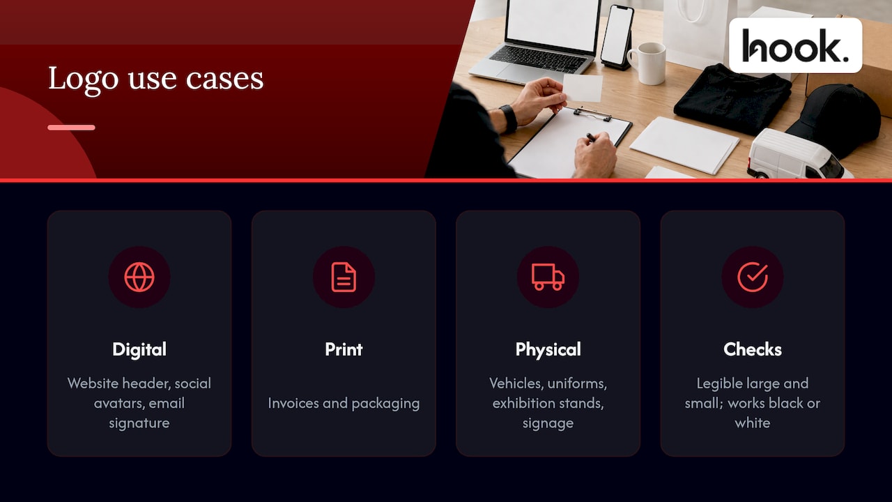
List the places before you draw anything: website header, social avatars, email signature, invoices, packaging, vehicles, uniforms, exhibition stands, signage. Design102’s guidance starts in the same place: know where the logo will be used, then keep it simple and legible at both large and small sizes, and make sure it works in black or white.
Build a small family, not one file
A practical logo set normally includes:
- a primary version, used where there is room;
- a stacked or compact version for square or narrow spaces;
- an icon-only or monogram version for avatars and favicons;
- full-colour, single-colour, black and white versions, so the logo works on photographs, dark backgrounds and in print where colour is limited.
If your logo has a strapline, make a version without it. Straplines are among the first things to become unreadable as the logo shrinks.
Start from a vector master
The master file should be a vector (usually saved as SVG, EPS or AI), which can be enlarged without losing sharpness. Everything else, including PNG and JPG exports for the web and PDFs for print, is generated from that master. A common problem we hear about is a business whose only logo is a small, low-resolution image saved from an old website. When it is stretched for a banner, it looks blurred and amateur. Ask whoever designs your logo to hand over the vector master and every export.
Test at the extremes
Before approval, check the logo at the smallest and largest sizes you will use it, on light and dark backgrounds, on a phone screen and on a printed page. If the proportions or the spacing between letters fall apart, adjust the design now. It is cheap to do before launch and expensive afterwards.
Write the rules down: brand guidelines
A redesign that lives only in the designer’s head will drift within months. Staff stretch the logo, a printer picks a slightly different blue, a freelancer sets the name in a different font. Guidelines prevent this by recording the logo versions, clear space, minimum sizes, colours, typefaces and examples of misuse.
You do not need a 60-page document. A short, clear set of rules that people actually open beats a thick one that no one reads. Our article on brand guidelines examples and what to put in yours shows what a useful set contains.
Budget, scope and rollout
The cost of a redesign is more than the logo fee. It includes trade mark checks, updating the website, reprinting stationery, changing signage and vehicle graphics, and refreshing social profiles. Plan these as one budget so there are no surprises halfway through. For realistic figures, see our guide to UK small business logo costs, trade mark and rollout fees.
A few tips that keep costs sensible:
- Phase physical items. Update signage, uniforms and print when stock runs out, so long as digital channels switch together.
- Prioritise high-visibility places first: website, social profiles, email signatures, proposals and invoices.
- Tell people. A short note or post that explains the change and why prevents confusion, particularly for long-standing customers.
- Keep a transition period where the old and new versions are both recognisable, which is another reason to keep key elements.
Our perspective
We are a full service marketing agency in Oxford, and most of the logo projects that come to us have the same shape. A business has outgrown its identity, but the logo is only one part of the problem. The website says one thing, the social profiles another, and the brochure looks like it came from a different company.
That is why we do not treat a logo redesign as a standalone drawing job. We start with positioning and with what your customers already recognise, then design the logo as part of a system: versions for every size, a palette, typefaces and clear usage rules. Because branding, design, websites, photography, video, social media and PPC sit under one roof at Hook, the rollout does not depend on briefing five different suppliers and hoping they agree.
Our scopes are tailored and transparent, with no forced packages, so you pay for the work your project needs. Our client portal keeps feedback and updates in one place, and we aim to turn around content and website amends within 48 hours, which keeps a launch moving once the new identity is live.
Hook
Work with one team on your redesign
If you are weighing up a refresh or a full redesign, our team can help you decide which one you need, then take it through research, design and rollout. Our branding and design service covers logo design and identity systems, brand strategy and positioning, and graphic design, with the website, photography, video and social work available from the same team.
If the redesign touches several channels at once, our full service marketing approach means one team plans and delivers the lot. You can also browse more of our thinking in the design section of the blog.
A pre-launch checklist
Before a new or refreshed logo goes live, run through this list:
- Can we state the business reason for the change in one sentence?
- Have we kept at least one recognisable element, or planned a clear explanation if not?
- Have real customers seen the options in realistic settings?
- Does the logo work at favicon size, in black and white, and on dark backgrounds?
- Do we have a vector master and all the export versions?
- Have trade mark searches been carried out and reviewed by a qualified practitioner?
- Are brand guidelines written, and does everyone who uses the logo have them?
- Is there a rollout order, a budget and a message to customers?
If you answer “no” to any of these, fix it before launch. It is far cheaper than fixing it after your customers have seen it.
FAQ
What is the biggest logo redesign mistake?
Changing the logo without a clear business reason, and in the process discarding what customers already recognise. Both lead to confusion without any benefit. Define the reason first, list your recognisable assets and keep the ones that carry your reputation.
How do I know whether I need a logo refresh or a redesign?
Choose a refresh when customers recognise the logo and the problems are practical, such as poor legibility at small sizes, no dark-mode version or dated proportions. Choose a redesign when your name, offer, audience or positioning has changed significantly. If you are not sure, begin with customer feedback on what they remember about the current logo.
What should a scalable logo include?
A vector master, a primary version, a compact or stacked version, an icon-only version, and single-colour, black and white variations. It should stay readable at tiny sizes, so avoid fine detail and keep straplines in a separate version. Test it on a phone screen and in print before approval.
Do I need to check trade marks before using a new logo?
Yes, it is sensible to. UK government guidance advises clearance searches for earlier registered and unregistered trade marks, assessed by a qualified practitioner, because the free online database search is not comprehensive. A trade mark attorney or IP solicitor can advise on your specific situation.
How long does a logo redesign take?
It depends on the scope. A refresh of an existing logo is much quicker than a full redesign that includes research, testing and a complete identity system with guidelines. We scope each project individually, so the timeline is agreed with you at the start.
Sources
- Advertising Week: What works and what doesn’t when a brand decides to rebrand
- Marketing Week: What does it take to get a rebrand right?
- Scottish Construction Now: Association for Project Management reveals new brand
- UK Government Design102: What are the top principles for great logo design?
- GOV.UK: Legal considerations for intellectual property
- GOV.UK: Unacceptable trade marks


