
.jpg)

.svg)
What is web design? A beginner's guide for 2026
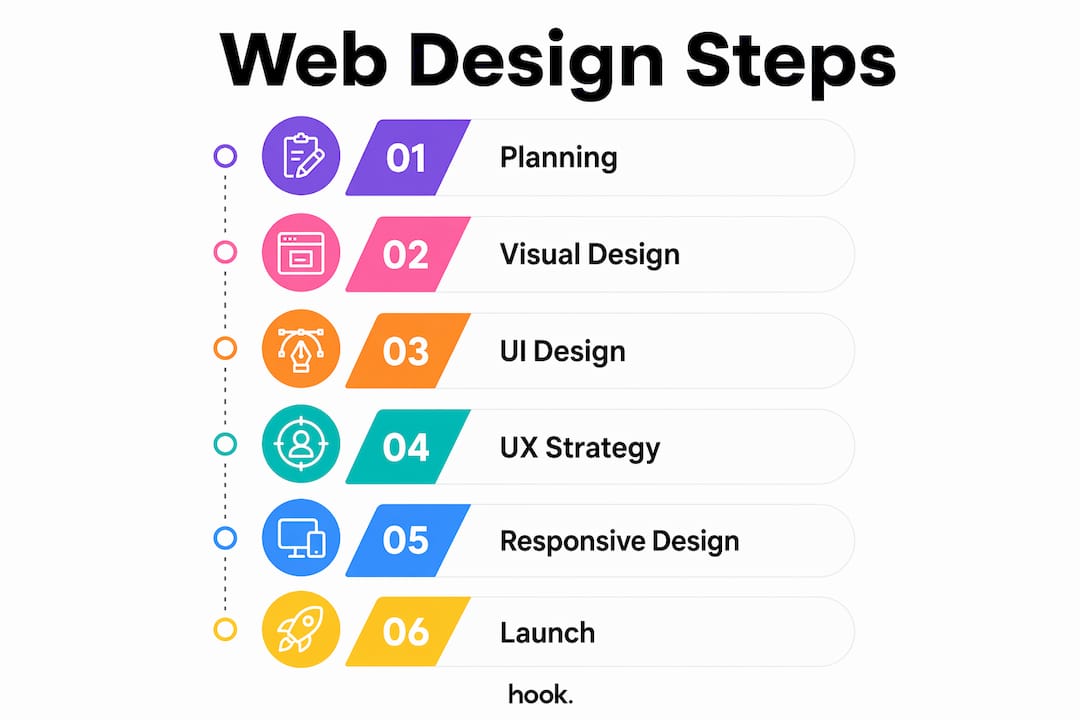
Web design is the process of planning, creating, and arranging the visual and interactive elements of a website to deliver a functional, accessible, and engaging experience. It is a multidisciplinary practice that combines visual design, user interface (UI) design, and user experience (UX) strategy. Web design is distinct from web development: designers shape how a site looks and feels, while developers handle the backend logic that makes it run. Core components include information architecture, responsiveness across devices, accessibility, and SEO compatibility. Understanding these fundamentals is the first step to building a website that genuinely works for your business.
What does web design involve?
Web design combines visual layout, UI design, and UX strategy to produce websites that are both attractive and functional. Each discipline plays a distinct role, and together they determine whether a visitor stays on your site or leaves within seconds.
Visual design covers the foundational elements that shape a site’s appearance:
- Typography: The choice of fonts, sizes, and spacing affects readability and brand personality. A poorly chosen typeface can undermine trust before a visitor reads a single word.
- Colour theory: Colours carry psychological weight. Blue signals trust; red creates urgency. Consistent colour palettes reinforce brand identity across every page.
- Layout and balance: Grid systems and white space guide the eye naturally through content, preventing visual clutter that overwhelms visitors.
UI design focuses on the interactive layer: buttons, navigation menus, forms, and calls to action. Every element a visitor clicks or taps is a UI decision. Good UI design makes those interactions feel intuitive, not confusing.
UX strategy sits above both. It maps the full journey a visitor takes through your site, from landing page to checkout or contact form. Accessibility considerations, such as sufficient colour contrast and keyboard navigation, are part of UX planning. They widen your audience and, in many cases, are a legal requirement.

Designers work with tools including graphic editors like Adobe Photoshop and Figma for prototyping, alongside markup languages like HTML and CSS for translating designs into live pages. In practice, web designers and web developers collaborate closely, with the designer handing off detailed specifications for the developer to build.
Pro Tip: If you are a small business owner without a dedicated designer, Figma offers a free tier that lets you sketch layouts and share them with a developer, removing the need for lengthy written briefs.
What is responsive web design and why does it matter?
Responsive web design is a methodology that ensures a website displays correctly on any screen size, from a large desktop monitor to a small smartphone. The goal is one codebase, one site, and a consistent experience for every visitor regardless of device.
Responsive design uses three core techniques to achieve this:
- Fluid grids: Page layouts are built using proportional units rather than fixed pixel widths. Columns stretch or compress to fit the available space.
- Flexible images: Images scale within their containers so they never overflow or distort on smaller screens.
- CSS media queries: These are rules written in CSS that apply different styles at specific screen widths, known as breakpoints. A two-column layout on desktop might become a single column on mobile.
Modern responsive design in 2026 goes further. Container queries allow layout adaptation based on the size of a parent element rather than the full viewport. This makes individual components more modular and reusable across different page contexts. CSS Grid and fluid typography via CSS are now standard tools in a responsive designer’s kit.
Responsive design is also a business decision, not just a technical one. Responsive methodology reduces maintenance costs because businesses avoid running separate mobile and desktop sites. It also improves SEO, since Google indexes the mobile version of a site first. A site that performs well on mobile ranks better and costs less to maintain over time.
Responsive design differs from adaptive design. Adaptive design uses multiple fixed layouts, each built for a specific screen size, and serves the appropriate one based on device detection. Responsive design is more flexible and is the industry standard for new builds in 2026.
How does web design affect business success?
Poor mobile-friendly design can cause businesses to lose up to 90% of potential customers. That figure reflects a simple reality: if your site is difficult to use on a phone, visitors leave and rarely return.
Good web design drives business outcomes in several direct ways:
- Conversions: Clear calls to action, logical page flow, and fast load times guide visitors toward the action you want them to take, whether that is making a purchase, booking a call, or filling in a contact form.
- Brand perception: Design choices communicate professionalism before a visitor reads your copy. A dated layout or inconsistent colour scheme signals that a business may not be keeping up.
- Repeat visits: A positive experience brings people back. A frustrating one sends them to a competitor.
- SEO performance: Google’s Core Web Vitals measure loading speed, interactivity, and visual stability. Sites that score well rank higher in search results.
Performance is where many businesses quietly lose ground. High-resolution imagery and complex animations inflate page load times and trigger SEO penalties. Designing for performance means compressing images, minimising unnecessary scripts, and choosing visual elements that load quickly without sacrificing quality.
“Good web design is invisible. Visitors find exactly what they need and take action without noticing the design at all.”
That principle matters for small businesses especially. Your website is often the first impression a potential customer has of your brand. A site that works as a marketing asset rather than a digital brochure generates enquiries around the clock, without you lifting a finger.
What tools and approaches help beginners get started?
CMS platforms and website builders allow you to create responsive websites without writing a single line of code. This makes them a practical starting point for small business owners who need a professional online presence quickly. Modern integrated tools increasingly blur the line between design and development, meaning one person can handle both tasks to a reasonable standard.
Practical starting points for beginners include:
- Content management systems (CMS): Platforms like WordPress give you full control over design through themes and plugins, with a large community of support resources.
- Visual website builders: Tools that use drag-and-drop interfaces let you see design changes in real time, reducing the learning curve significantly.
- Prototyping tools: Figma and similar applications let you plan layouts before building anything, saving time and avoiding costly redesigns later.
The mobile-first philosophy is the most important mindset shift for beginners. Rather than designing a full desktop site and then scaling it down for mobile, you start with the smallest screen. This forces you to prioritise the content and navigation that genuinely matter, and the desktop version benefits from that clarity.
Balancing aesthetics and functionality is the central challenge for anyone starting out. A beautiful site that loads slowly or confuses visitors fails its purpose. A functional site that looks dated loses credibility. The goal is both, and the good news is that modern tools make achieving both more accessible than ever.
Pro Tip: Start every new design project by writing down the single most important action you want a visitor to take. Every layout decision should make that action easier to find and complete.
Key takeaways
Web design is the combination of visual design, UI, UX, and responsive techniques that determines whether a website earns trust, holds attention, and converts visitors into customers.
| Point | Details |
|---|---|
| Web design vs web development | Designers shape appearance and experience; developers build the backend logic that makes sites function. |
| Responsive design is standard | Fluid grids, CSS media queries, and container queries ensure one site works across all screen sizes. |
| Business impact is direct | Poor mobile design can cost businesses up to 90% of potential customers, making responsiveness a commercial priority. |
| Performance affects SEO | Google’s Core Web Vitals penalise slow sites; designing for performance protects search rankings. |
| Mobile-first is the right starting point | Beginning with the smallest screen forces content prioritisation and produces stronger designs at every size. |
What good web design actually looks like in practice
After working with businesses across a wide range of sectors, the pattern I see most often is this: owners invest in a website that looks impressive at launch and then quietly stops working within two years. The design becomes dated, the mobile experience degrades as new devices arrive, and the site drops in search rankings because performance was never considered a design concern.
The uncomfortable truth is that most websites are built to satisfy the client at sign-off, not to perform for the visitor over time. Good web design is not a one-time event. It is an ongoing commitment to usability, performance, and relevance.
The businesses I see getting the most from their websites treat design and marketing as the same conversation. They think about what a visitor needs to see, in what order, and what action they should take next. That thinking produces sites that generate real enquiries rather than just existing online.
Responsive design and mobile-first thinking are no longer optional extras. They are the baseline. If your site is not performing well on a phone in 2026, you are not competing. The good news is that the tools and knowledge to fix that are more accessible than they have ever been. The barrier is not technical. It is knowing where to start.
— Hook
Web design support from Hook-digital
If you are ready to build or refresh your website, Hook-digital offers conversion-led website design built around your business goals. Based in Oxford, Hook-digital handles everything from initial concept and branding through to a fully responsive, performance-optimised build.
Whether you are a small business owner starting from scratch or an established brand looking to improve your online presence, Hook-digital’s branding and design services bring together visual identity, UX thinking, and technical execution under one roof. No need to coordinate multiple agencies or translate briefs between teams. Get in touch to discuss what your website needs to do and how Hook-digital can make it happen.
FAQ
What is the definition of web design?
Web design is the process of planning and creating the visual layout, user interface, and user experience of a website. It covers everything a visitor sees and interacts with, from typography and colour to navigation and page structure.
How does web design differ from web development?
Web design focuses on the appearance and usability of a site, while web development handles the backend code and server logic that makes it function. The two disciplines overlap but require different skills and tools.
What is responsive web design?
Responsive web design is a methodology that uses fluid grids, flexible images, and CSS media queries to make a website display correctly on any screen size. It is the current industry standard for new website builds.
Why does web design matter for small businesses?
Poor mobile design can cause businesses to lose up to 90% of potential customers. A well-designed site builds trust, improves search rankings through Google’s Core Web Vitals, and guides visitors toward enquiries or purchases.
How can a beginner learn web design?
Beginners can start with CMS platforms and visual website builders that require no coding knowledge. Learning the mobile-first philosophy and practising layout planning with free tools like Figma builds a strong foundation quickly.
Recommended
- How to brief a design agency: a practical guide | Hook Digital - Oxford’s Premier Full-Service Marketing Agency
- Design | Hook Digital - Oxford’s Premier Full-Service Marketing Agency
- The Design Yard | Hook Digital - Oxford’s Premier Full-Service Marketing Agency
- Top 3 Website Design Agencies in Oxfordshire 2026 | Hook Digital - Oxford’s Premier Full-Service Marketing Agency
.png)